- STAGE:
- In Development
- PROJECTED DONE:
Challenges Reports Dashboard: One Updated Chart, One New One
The Challenges Dashboard's Engagement tab is getting a sharper view of how participants move through fixed-start challenges (challenges where everyone begins on the same date and moves through each phase on the same schedule). The Weekly Active Participants chart is reworked to show registration growth and phase timing alongside weekly activity, and a new Phase Engagement chart shows what participants do inside each phase.
What's Changing
Updated Graph: Weekly Active Participants
The chart runs week by week (Monday to Sunday) from the registration start date through the end of the challenge, including any grace period. Challenges still running show weeks up to the current one. Every week in that range appears, and a week with no completions shows as zero. The chart now includes:
Registered so far—background shading shows cumulative registrations, so you can watch sign-ups grow and level off when registration closes.
Active participants—a line shows the distinct participants who completed at least one activity that week.
Phase bands—each phase appears as a labeled background band, with a marker where the challenge starts, so weekly activity lines up with the phase participants were in.
Clearer tooltips—hovering a week reads like "Week of Jan 5 · 42 of 60 registered active (70%)."
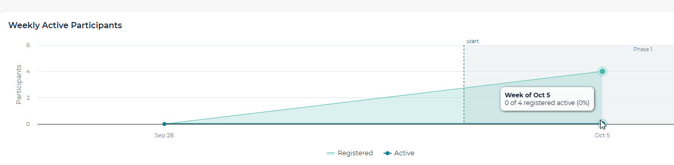
The Completing series will be retired. It totaled activity completions in a week, which could run higher than the number of participants on the same axis. Phase completion now has its own chart, since phases can run 1, 7, or 14 days and don't line up with calendar weeks. The chart's info text is updated to describe the new series.
New Graph: Phase Engagement
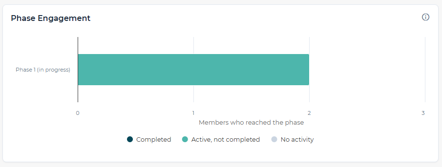
This new graph will show a stacked bar for each phase representing the participants who reached it, split three ways:
Completed the phase—the member's phase completion is recorded, matching what members see on their own screens.
Active in the phase—completed at least one activity in the phase but didn't complete the phase.
No activity—reached the phase and completed no activities in it.
 |
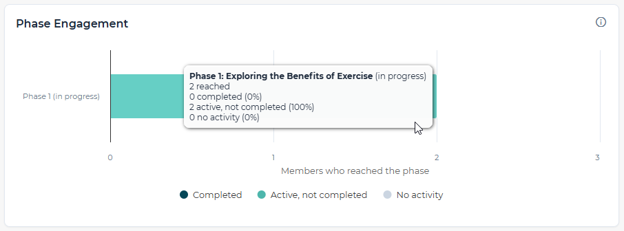 |
Hovering a bar shows the full breakdown, with the number and percentage of participants who've completed, are active in, and are not active in the Challenge phase.
The phase currently running is marked as in progress with a label or muted style, so participants who still have time to finish don't read as low completion. Phases that haven't started yet are left off the chart.
Why It Matters
Numbers You Can Take to Leadership—Active participants are measured against registered participants each week, so engagement reads as a percentage anyone can follow.
See Where Momentum Builds—Phase bands line weekly activity up with the phase participants were in, so you can see which parts of a challenge draw people in.
Pinpoint Where People Drop Off—Phase Engagement separates people who finished a phase, people still working through it, and people who never started it, so you know where a nudge or reminder would help.
Fair Reads on Challenges in Progress—Phases still running are marked as in progress, so a challenge isn't judged before participants have had the time to finish it.
Client-Ready Reporting—Benefits brokers and HR consultants get charts that explain themselves in a client review, with no extra export or footnotes.
Together, these charts show who is taking part, when, and how far they get, so every fixed-start challenge tells its own story.