- STAGE:
- In Development
- PROJECTED DONE:
Notes UX/UI Redesign
The Notes experience in Member Admin is getting a meaningful upgrade with a cleaner layout, a smarter editor, and filtering and search tools that make it easier to find what you need across a member's note history.
What's Changing
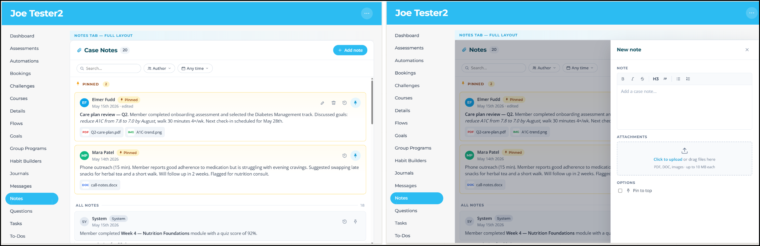
Modernized Layout and Flyout Editor
The new editor opens as a flyout from the right side of the screen, keeping the member record in view while you write. Formatting options are practical and uncluttered: bold, italics, strikethrough, numbered lists, bullet lists, H3 headings, and blockquote.
Filter by Author, Date, or Text Search
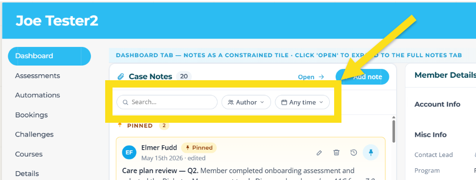
Three ways to cut through a long note history: the search bar queries note body text directly; the author filter is scoped to people who've written on that record; and the date filter offers five preset ranges (Any time, last 7 days, 30 days, 90 days, and 12 months).
Why It Matters
Less time hunting, more time acting—Finding a specific note used to mean scrolling and visually searching, but now the process is much easier with new ways to quickly find what you're looking for.
Cleaner documentation for reporting—A searchable, filterable note history makes it easier to pull meaningful context for updates or member handoffs.
Multi-staff accounts finally make sense—The author filter changes how teams with multiple staff touching a record collaborate and audit activity.
The Notes redesign turns one of the quieter corners of Member Admin into a tool that earns its real estate.